Lujo Media Co.
Branding & Logo Design
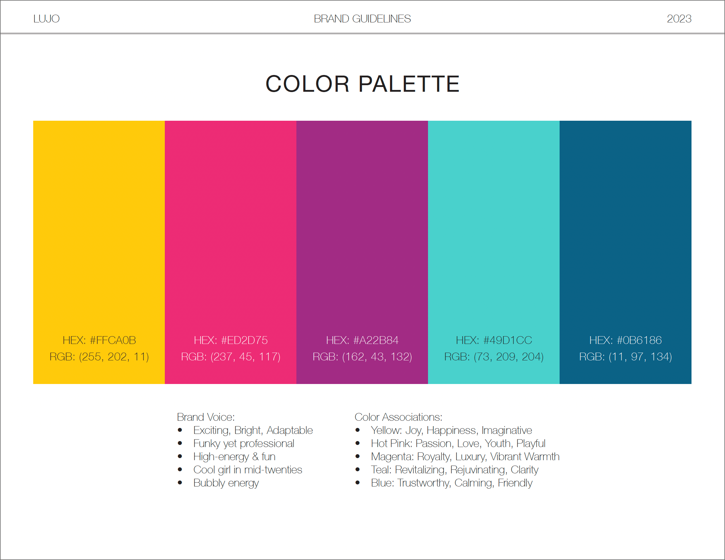
COLOR PALETTE
CLIENT GOALS
Houston-based Social Media specialist, Lexi Elder, inquired for a complete rebrand of her company, Lujo Media Co. Lexi strived for an eye-catching brand that gave out a funky, bubbly and fun energy.
DESIGN CONCEPT
Lexi has a fun, bubbly energy herself that we wanted to shine through in her branding as her clients would be working directly with her on their marketing projects. The goal was to have her brand inspire excitement, outside-the-box creative thinking, and adaptability.
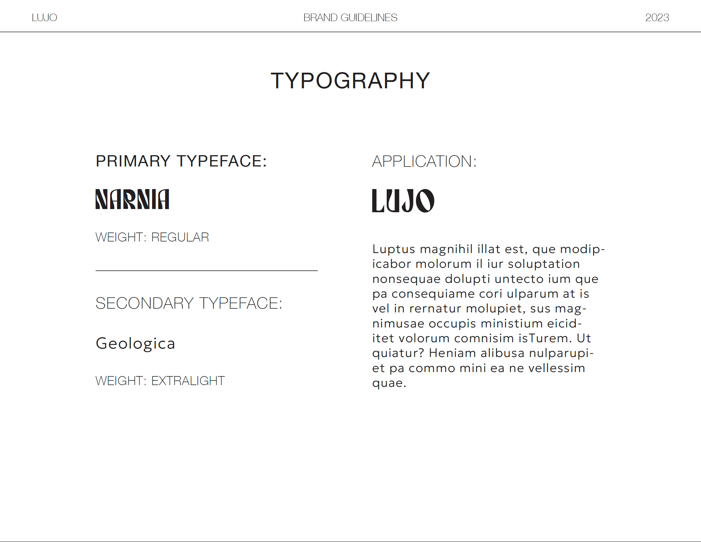
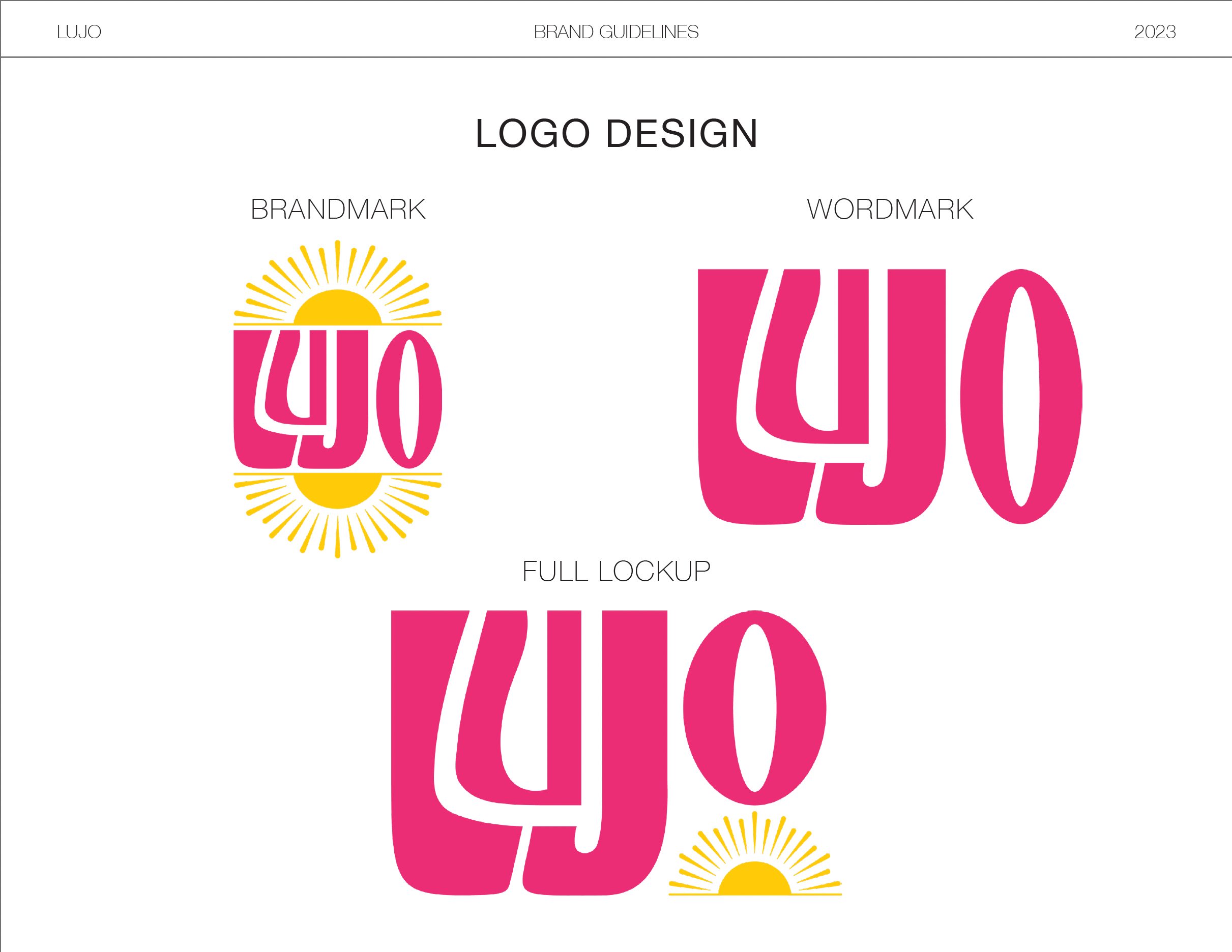
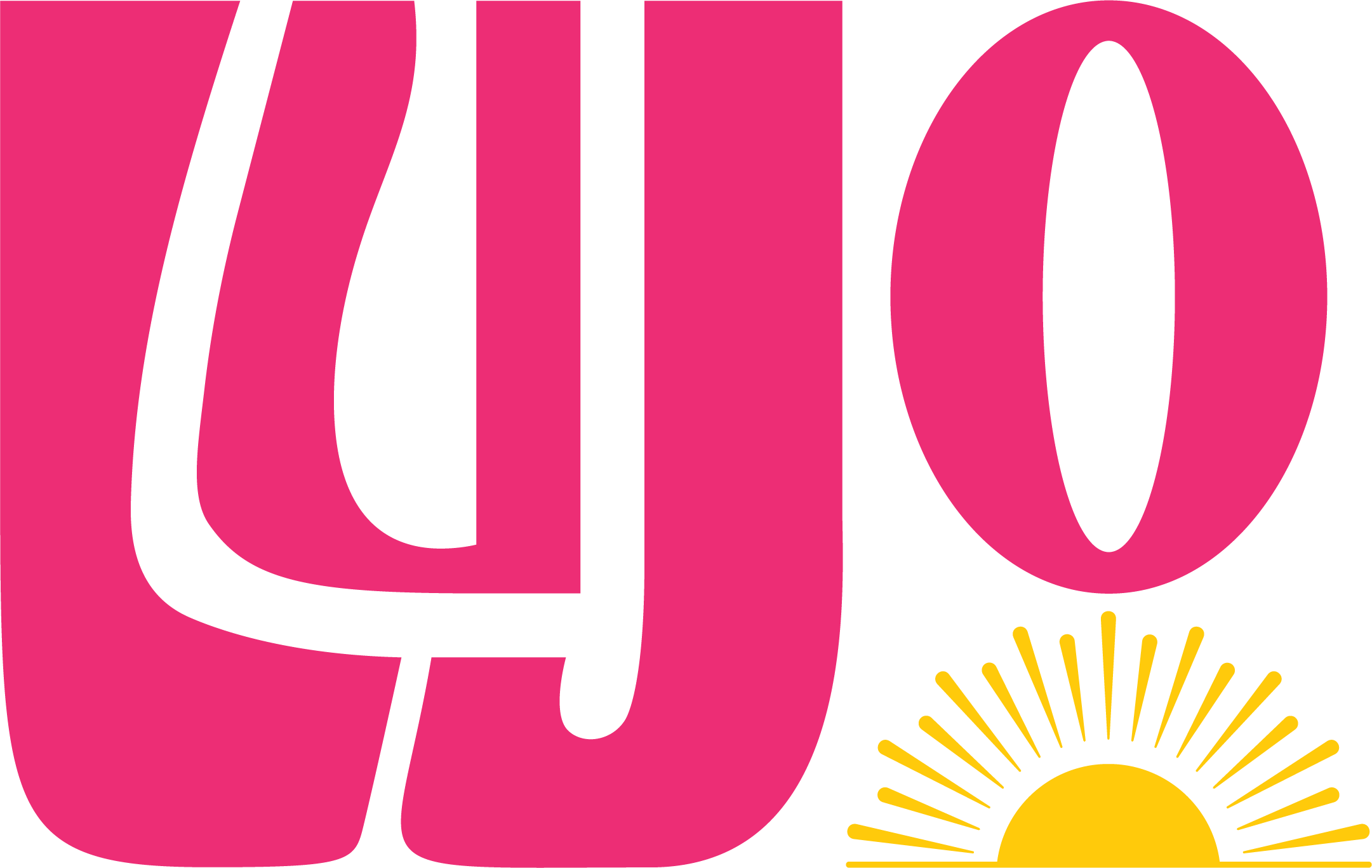
To bring this vision to life, Mackenzie designed a bright and playful sun — a symbol of life, excitement, happiness and positive energy. Mackenzie played with negative space in the name “Lujo” for the full lockup, placing a rising sun in the empty space beneath the “O”. The client and the designer worked together to curate a special version of the chosen typography that would both provide and fill in negative space to play with.
The brandmark provided an opportunity to rearrange the letters into a more uniform arrangement to provide a parallel line against the sun’s horizon line. To bring symmetry into this design, Mackenzie added a reflection of the sun icon, representing how a sunrise or sunset reflects onto the ocean.
FINAL LOGO MOCKUPS
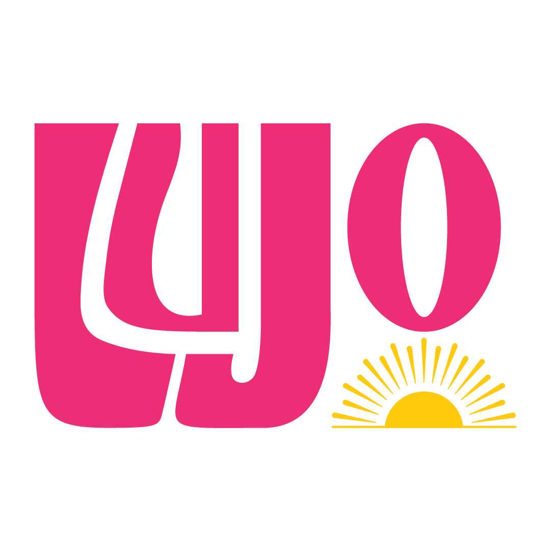
FULL LOCKUP
ICON & FAVICON
| CURATED IN 2023 |

