Anderson Aquatics
Branding & Logo Design
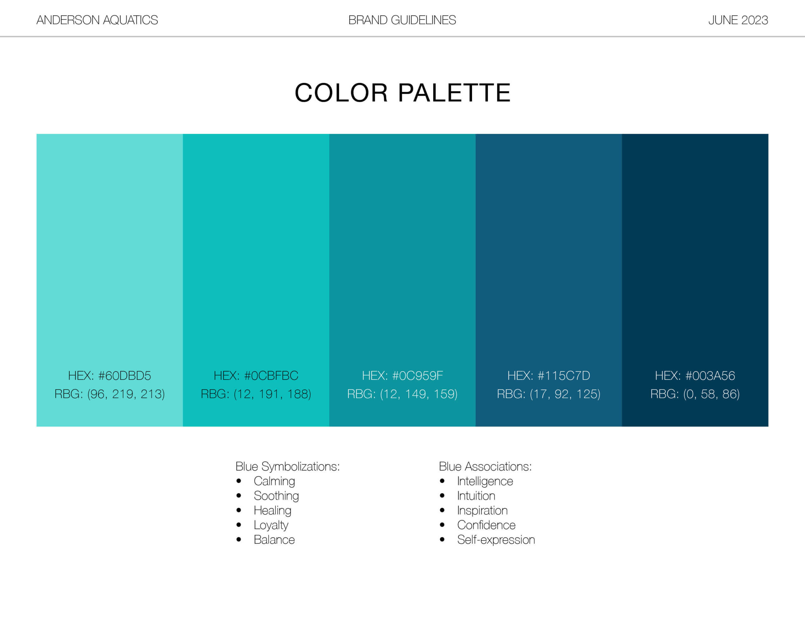
COLOR PALETTE
CLIENT GOALS
Santa Barbara-based Aquatics & Wellness company, Anderson Aquatics, inquired for a complete rebrand for their company, with an water-inspired theme.
DESIGN CONCEPT
Anderson Aquatics provides wellness and rehabilitation services at local and clients’ home pools, including Aquatic Body Work, Physical Therapy, Yoga and Personal Training in the water. This sparked the inspiration for a water-themed brand with an emphasis on wellness and love for their patients.
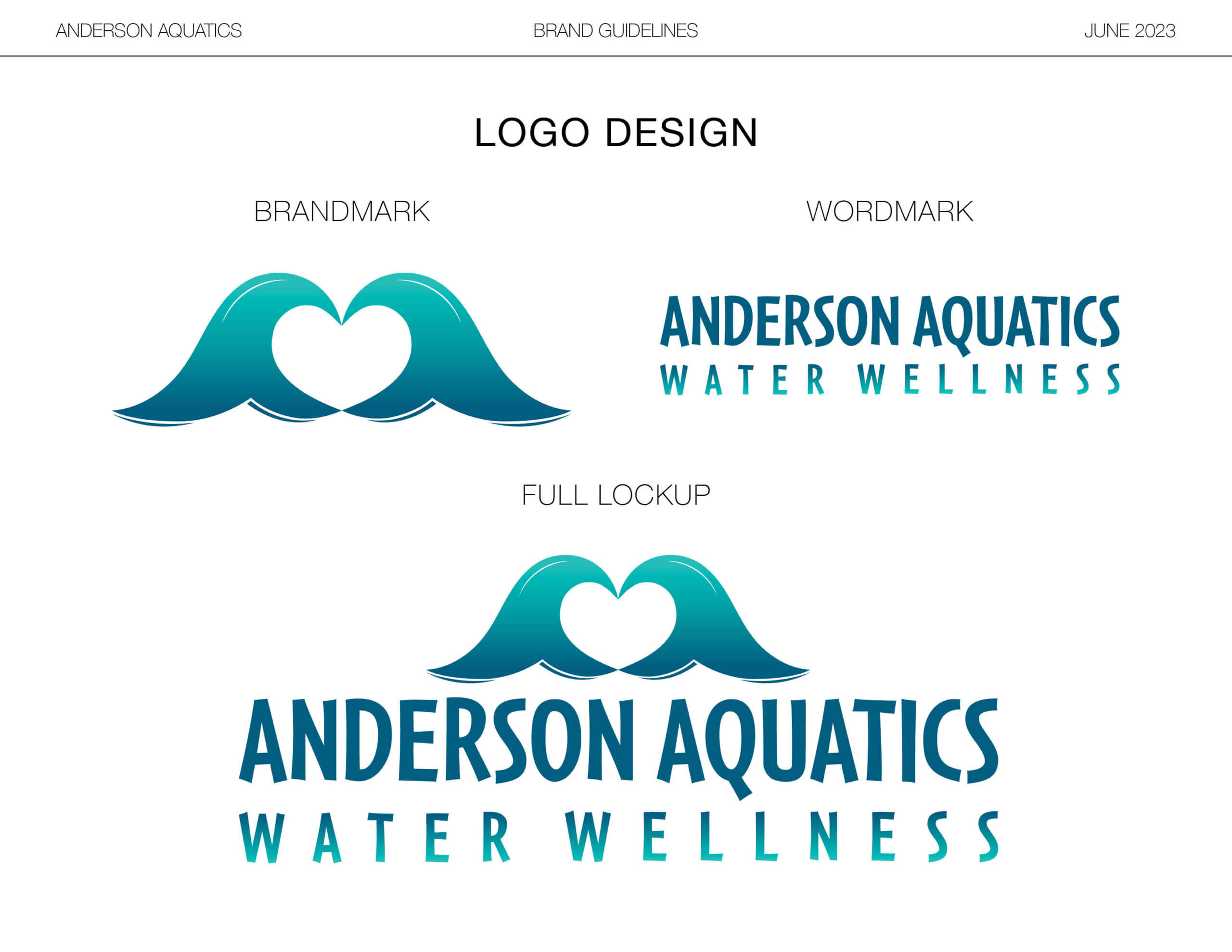
To bring this vision to life, Mackenzie was called to incorporate a heart, a symbol of love, into the design. With the curvature of a wave, or a ripple in a pool, this provided an opportunity to use negative space to symbolize a heart. The reflection of these two waves also resembles the “heart-hands” symbol – two hands framed together to create a heart – a recognized symbol that represents love and care.
FINAL LOGO MOCKUPS
FULL LOCKUP
ICON & FAVICON
| CURATED IN 2023 |


