JT REAL ESTATE GROUP
WEB DESIGN & LOGO DESIGN
WEBSITE DESIGN
COLOR PALETTE
CLIENT GOALS
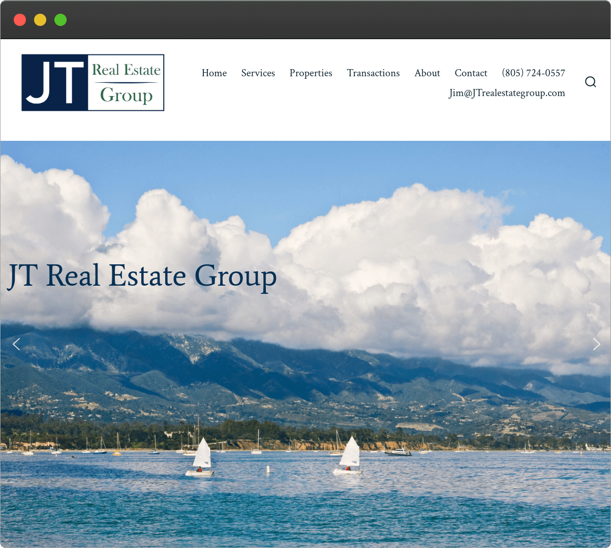
Santa Barbara-based Real Estate firm, JT Real Estate Group, inquired for a professional website to advertise their real estate Company and list their available properties. The site would also serve as a portfolio for the properties their company has sold.
DESIGN CONCEPT
Fell Creative worked directly with owner Jim Turner of JT Real Estate Group to carefully select imagery that best displayed the beautiful environment of downtown Santa Barbara. The site would portray their track record of leased and sold properties as well as display their current available properties.
LOGO DESIGN
CLIENT GOALS
The client inquired for a sleek and clean looking logo with a blue, white and green color scheme. They wanted the “JT” to catch the eye while leaving room to write out the full company name.
DESIGN CONCEPT
For this logo, we selected the dark tones of each requested color to provide a sophisticated look. This layout allows the logo to be clearly read left to right while putting emphasis on the “JT.” The shape of the divder line brings depth to the logo. We paired a sans serif font to highlight the JT with a serif font to portray an elegant and professional look for the company.
| CURATED IN 2021 |


